Ideas
Farms – where veg is grown organically by hansom farmers and their smiling wives and children amidst contented livestock and pretty farm buildings. Sunshine essential
Sunshine – essential for ripening
Characatures/Personifications – engaging with people by using character to draw them in
Positive and Negative effects of VEG on people…
Postitive:
- Fresh
- Varied
- Flavoursome
- Crunchy
- Nice texture in mouth
- Colourful
- Solid
- Dependable
- Healthy – Brownie points from your doctor
Negative:
- Complicated prices – hard to buy
- Not always in packs – not easy to take off the shelf
- Needs preparation – which needs knowledge of preparation
- Need to pre-wash to get rid of pesticides
- Rots
- Allergies
- They’re not biscuits (which are Sooooo easy to snack on)
- Unpredictable lifespan and ripeness moments
- Forced to eat them as a child
- Onions make you cry
- People complain when given veg they dislike (esp your own children)
Ideas from these… present so that it looks easy to buy and eat: a single piece or a definite number (like 2 onions or 4 baking potatoes) as if picked and almost packed for you. Include faces of people smiling at the veg.
Brief says Fruit or Veg – so both are included, which makes it easier… and harder too.
List of Fruit and Veg appropriate to each season:
Autumn (Sep, Oct, Nov) from http://greatgrubclub.com/in-season#.VeGvLNNVhHw
- apple
- blackberry
- butternut squash
- Brussels sprouts
- cabbage (savoy and spring green)
- carrot
- cauliflower
- celery
- kale
- leek
- onion
- parsnip
- pear
- potato
- pumpkin
- purple sprouting broccoli
- spinach
- turnip
Summer (June, July, August) from http://greatgrubclub.com/in-season#.VeGvLNNVhHw
- apple
- basil
- beans (runner and French)
- beetroot
- broccoli
- carrot
- cauliflower
- celery
- courgette
- cucumber
- fennel
- lettuce
- onion
- potato
- radish
- raspberry
- red onion
- rocket
- rhubarb
- strawberry
Where Am I
I’ve had a few false-progresses with this Assignment so I’m going back to the beginning to find out where I am and what I ned to do.
Where are my notes? The work that I do doesn’t stay in my head. I’ve got many pages of visual notes in my sketchbooks but I forget that they are there… I”ve started with Aubergine, Pumpkin, Strawberry, Watermelon and Celery. I haven’t kept up with putting that progress here, in my learning log, so I can’t see it! I’ll put that right in a moment.
Reading of the brief: I haven’t been carrying the right thing around in my head for the brief. There are certain tracks that the brief leads me on that I haven’t been anticipating. It actually requires an end artwork for each season, Summer and Autumn, but has an intermediate stage where an objective study of the veg is asked for. I’ve been confusing the two and thinking that the final artwork is somehow an objective work. I think this is my comprehension skills not fully connecting with the right side of my brain where a lot of the thinking happens. I need to pay more attention to that because I’m getting confused.
What to do: I’ve started to look at different media that can be used to represent the food. I need to collect some real-world illustrations to demonstrate some applied techniques. In my sketchbooks I’ve used ink and pencil to explore some examples. I need to try some watercolour as I feel like that will be good at showing a quality of the food that is appetizing (this is intuition – I don’t know why yet). I tried out producing food images in Illustrator
Watercolour


It turns out that I’ve already painted these veg in watercolours but I’d forgotten (I was pleasantly surprised to find them just hanging out to dry).
The aubergine did not come out as scrumptious-looking as I was hoping. I had thought that I’d be able to create soft transitions and even colour but my watercolour experience is not enough even to know if it is possible.
Ink and Pencil


I’ve experimented with drawing smaller sketches of these veg. The Aubergine in my drawing is rather pale compared to the real vegetable and this, strangely, increases its niceness on the page. It might just be that darker colours are harder to handle but it may also have to do with the colours of ‘bruises’ also being the darker colours so this may tend to influence the look.


These pictures I did, examining the way the vegetable is put together, really suffer from poor looks when I try to make them suitably dark. I had limited pens available to me so I tried to be creative with blues and browns but the whole veg is a mess. On the next page I tried using just one pen colour for each sketch creating darker areas by going over them in the same colour. This had amore pleasing effect even in Blue or Green which are nothing like the real colour of an Aubergine.
Comparing my pen and pencil sketches with these latest ones it is interesting how much ‘character’ is in the sketches done with a black fine-liner and coloured pencils. It is perhaps the case that the very nature of these coloured-in line drawings gives the viewer the deliberate message that these are ‘not real-looking’.
This is similar to the ‘Uncanny Vally’ – familiar to the making of Androids that look almost human, but not quite. Perhaps these drawings are far enough away from the life-like representation of their subject that the view no-longer needs to believe that they are life-like and can accept them as representations of very nice veg.
The same might be said of the pumpkin which, in watercolour, starts to look rather reasonable (maybe because we don’t expect ‘shine’?) but even so, the fine-liner and coloured pencil version seems to appeal more, even though it does not look more realistic. It is a representation of a very nice pieces of veg and I think our brains fill in the gaps to make it into the nice food that we wish to expect.
Objective or Subjective
These experiments have brought me to a new question about the final outcome of the illustration that I am aiming to produce for this assignment. Obviously I shall be attempting an illustration of accurate, objective quality for the intermediate stage of the assignment but for the final part I can take this in any direction.
The experiments above are starting to point very clearly towards a subjective illustration where the ‘Perfection’ of the produce is brought out at the expense of the objective reality of the work. All of the pointers and notions in the brief about food being ‘appetising’ and not putting people off would normally indicate to me that maximum realism is required (in fact, why not a really hi-res photograph?). But this is not the case.
Illustrator and Photoshop


Experimenting with creating the Aubergine image directly in Illustrator. Not being too concerned about the exact shape at this point but mainly wondering how shine is created and is the image realistic.

This one was created in Photoshop. The difference is how the highlights and lowlights are produced – using a brush rather than a vector shape. Using the benefits of Photoshop I was able to adjust the colour and levels of the three layers: Flat purple Aubergine flesh background; Highlights mask on curve; lowlights mask on curve. I was ignoring the green parts for this test.
Of all the illustrations of this particularly awkward produce that I’ve made so far this is the one that starts to look the most ‘photoreal’. One of the most awkward aspects of this vegetable is that the whole look is dependent on the reflections of the environment around it. Every window, light and shadowed area in the room contributes to those highlights and lowlites, including a discernible shape of me, the artist, when I’m drawing it. On the plus side this means that I could find a setting that shows it to its best. It’s a remarkable surface texture. Although it is highly mirror-like there is also a degree of diffussion – each tonal area is soft edged, limned with a feathered glow.
I n the Illustrator versions I like most the more graphic look without the soft edges or extra lowlights. I’m drawn to it because it tries not to be too fussy – my imagination makes it into a ‘perfect’ vegetable rather than my attempts at shading. The Photoshop version is much better for the shading results and could be even more objectively correct given a lot more time – I feel like the tools to do this are there in the software.
None of the computer drawn illustrations approaches the friendliness of the fine-liner and coloured pencil sketches which seem to allude to something more ‘Organic’.

This was a quick attempt at a tomato in Illustrator. It was hampered by the method of using a gradient mesh which accentuated the grid shape of the mesh. Photoshop seems a better bet for this kind of shading work.
==== STOP PRESS ====
We interrupt this blog-cast to bring you breaking news… mass panic is spreading after a well-known supermarket chain declared that unless their customers buy more Aubergines by 13th February, innocent Aubergines would suffer.
This is the first time that terrorism has been enacted by this Supermarket chain who say they have been forced into this position by the underhand tactics of their competitors and the increasing disloyalty of their loyalty card holders. Many customers are now habitually carrying four or five loyalty cards as well as frequenting discount chains where they may purchase goods in an untraceable manner.
This latest escalation has been broadly condemned by at least the three traditional high street grocers that we managed to find for comment, who say they that “the 13th looks like it’s going to be unlucky for some” and are preparing themselves for a St Valentine’s Day massacre.
Stay tuned… Keep it fresh… we’ll bring you more news as we hear it
==== ENDS ====
…this thread is continued in Winter Aubergine and in the parallel post Winter Aubergine Commentary which two posts ought to be read ‘Face en Face’ to allow one to explain the other.
The Winter Aubergine is a fictional scenario that I’ve created – I’m looking to use it as a device to carry my development to uncharted areas.
Drawing types…
- Forensic
- photographic evidence
- Good/Bad Carbon (Charcoal) footprint
- Courtroom – in the dock (leaves?)
- Placards
- Grafitti
Developing Big Eyes

Experimenting with the big eyed look – this works for what I’m trying to achieve which is a sense of ‘guilt’ for not buying the Aubergines.

trying out watercolour pencils to blend the Aubergine skin here.
Overall I’m very frustraed with watercolour… tubes or pencils… and I realise that I would need a good deal of experience with that medium to put this problem right. There always seems to be colour variances which I’m sure are to do with how I’m applying the water and using the brush but I can’t figure out what to change.

This is a bigger version of my original sketch

Just doodling with the aubergine I stumbled across a chance similarity between the top of the aubergine and the star of David which Jews were forced to wear in Germany from sometime before WW2. Somehow this nails it – it makes the connection between the veg and the metaphor quite strongly. I might dispense with the correct colour for the ‘green top’ in order to shift the perspective towards the metaphore.
The remaiing problem is colour – I’v only be able to produce suitably clean colour on the computer so I’ll use a hand-drawn line image and add the colour using photoshop.

I developed the idea of a prison or concentration camp above with an over-sized aubergine plugging a hold in the fence. The theory is that by removing the aubergine (when a customer buys it) they open the breach for the prisoners to escape. This struck me as being either ‘Goodies’ (1970s/80s TV comedy) or computer game (a spin off for the supermarket to educate the children perhaps!).
I wondered about the use of colour for the whole thing… making the aubergine stand out. The purple colour is very useful for that as it is easy not to use purple anywhere else.

This final image was produces as a pencil sketch which was coloured in Photoshop. I’ve also added some texture to the striped shirt fabric.
Summer Strawberry
The strawberry’s tale has been harder to follow to a conclusion.

My thought has been to mirror current politics with the Nationalist movements wishing to exclude foreigners (aubergines in winter) and look towards a British Grown fruit – the Strawberry. This particular fruit is ideally suited to the Nationalist cause as it is Red (like the St George Cross), associated with Wimbledon and grown here in fields where signs proudly proclaim ‘Pick Your Own’. This phrase has the cynical reading of choosing your ‘own creed’. The whole thing falls neatly into the Nationalist camp… er… whilst being innocent strawberries.
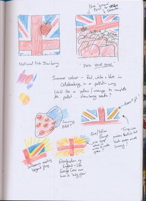
I have had in mind to use Red, Blue, Yellow, Orange and Green for this – bright colours associated with summer (Blue sky, Orange/Yellow sun etc) which led on to looking at the Union Flag as a National Symbol, perhaps swapping out the colours slightly.

In nationalist terms the Union Flag is an interesting example… it still clearly represents the flags of the individual nations – England, Ireland (N) and Scotland. Wales is represented as combined with England’s St George Cross.

In keeping with the existing metaphore I’ve tried to see if the Strawberry will fit Nazi symbolism.

Swapping the blue parts of the Union Flag for triangular strawberries was interesting, but seemed a little weak visually. It could be developed to be stronger perhaps.
I’ve made a visual list here of some visually English National ideas – Roses, Churches, High Tea, Crown (Monarchy) and cucumber sandwiches (a favourite of Lady Penelope I believe).

Here I’m looking at the seeds on the surface (a particular peculiarity of this fruit) and how they might play a part in the symbolism.

Thinking here a little about our stereotyped idea of the kind of person who belongs to a Nationalist group – inherently xenophobic, perhaps looking presentable, perhaps not!
One quite strong idea here is to use the ‘Punnet’ – traditional container used to collect strawberries when picking your own – presented against an English summer backdrop. The Punnet is extremely useful place where suitable imagery can be presented. I’ve tried a Union Flag but the words ‘Pick your own’ would seem here to be in a harmless context whilst perhaps delivering their more cynical message to the initiated.
So then I come to the strawberries themselves… they seem now to be the least important part of the image so long as their are recognised as being strawberries that is enough.
This style of presentation – the elaborate visual story – seems to belong in the ere which inspired it. The 1930s-50s before photography really became a strong alternative to the illustration. Today supermarkets seems to just use huge photos of the fruit and veg – beautifully lit and without ornament. The strength of an illustration is to be able to simplify and show only the details that matter for the message without all of the distracting details. The extreme of this would be the graphic image.
Required Elements
I’ve discovered that a strawberry image requires some or all of the following:
- Red – the majority colour
- Green – stalk, enhances ‘freshness’ and opposes the red to make a vibrant image
- White – the skin is shiny and specular reflections look white; the interior of the fruit also has white areas
- Seeds – the characteristic pattern of ‘dots’ that covers the outside of the fruit.
- Shape – approximately heart-shaped, but some leeway as they vary in shape
To put this all in our required Nationalist context I’m going to use the punnet as a flag and slogan bearer. It can be brimming with strawberries and placed in front of an idyllic, English landscape… just add cream!

Here’s a sketch of a possible final layout. I discovered that the handle on a punnet (as I remember them!) can be coloured along with the top band of the container to look like a St George Cross. Adding a white liner helps make the background for this flag correct.
The backdrop to the punnet is an English countryside.

This was an experiment in creating an English landscape using watercolours. I have some idea how I need to do it but I definitely need a whole lot more experience with watercolours to get the kind of result I’m looking for.


These three pages represent exploration of the scene for the illustration – seeing how to present the view of the Punnet. The final choice is a low down view that gives the ‘flag’ a monumental look – bigger and and more ‘above’ and commanding.
It took me a while to understand how the specular highlight of the strawberry is actually rendered using pencils! It’s a bit like a chesterfield sofa.
I abandoned the Union Flag reluctantly – it looks really good in the picture but dilutes the specific appeal that I’m going for. I’m intending to sketch this in pencil and colour it in Photoshop and perhaps see if the pencil sketch can be turned off at the end. In this case I might be able to introduce some blue using the shadowed parts of the objects, and perhaps some ‘gold’ (orange/yellow) highlights from the sunlight which will be coming from the front and high up (like summer!).
Strawberry final artwork
I’ve started to colour the very lightly sketched line art for the final Summer Strawberry work.
When I came to make the first strawberry I discovered something about my use of Photoshop as compared to real-life media – I understand it a lot better! this was not obvious as I had often been frustrated with the limitations of having to use a mouse asa proxy. Drawing anything that looks ‘natural’ (ie: not computer graphic) is challenging. This time however, perhaps because I’ve studied strawberries in the course of this assignment, I found that I could work out what to do to get what I wanted.

This is my first strawberry. It probably didn’t have to be this detailed for this particular illustration but it has a number of properties that I personally couldn’t achieve using watercolour, pencils or similar…
- I can work on details by zooming in
- I can control the colour easily
- It’s quicker to experiment with colour variation
- Using layers I can adjust one aspect without affecting the others
Second strawberry:

With my second strawberry I’ve refined the method to make it simpler – the strawberries are small in the picture and might look better if they are described with more economy.
The seeds are not exactly correct as they are just the pits rather than the tine seeds in the pits. Other strawberry designs use a single mark for the seed and its pit – that’s enough for us to recognise and understand what is being represented.

So I think this might take a while… I should submit the assignment on the basis that this is the plan – it just needs completing.
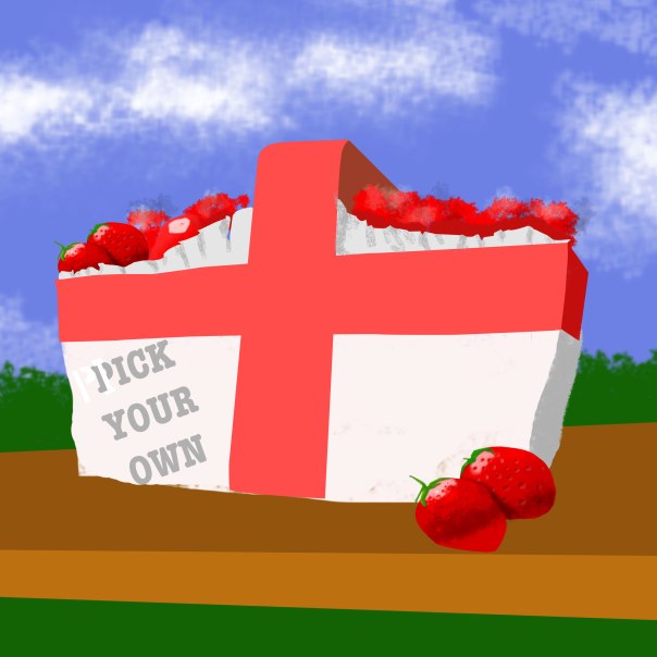
This is a very rough idea of the finished picture. It reveals that I have some more thinging to do about the content of the image at the bottom – it’s a bit bland. Perhaps the whole thing can have a tighter crop? The ‘table’ might also need re-thinking about as it dominates the picture – the brown colour I’ve shosen here is over-powerful compared to the St George Cross which should be the dominating effect.
Lately this somewhat facist politicised image has taken on a new meaning WRT Brexit! It’s not just about British fruit now – in the current political context its meaning would be interpreted as being in favour of the ‘out’ campaign in the European referendum. A danger for a supermarket employing national imagery is that it could find itself unwittingly appearing to support one view that didn’t exist when the imagery was chosen. Another example of this is are the dozens of companies that based their business names on the river in their local area in Oxfordshire… the river Isis. Unfortunate that the word ‘Isis’ has much more recently become associated with the latest offshoots of Wahhabist movement and its most extreme activists.